Contents
Logo Design Elements: Key Definitions1. Logotype (Wordmark)2. Icon (Symbol or Mark)3. Tagline (Slogan)4. Combination Mark5. Submark6. Variations7. Color Palette8. Font Variations9. Grid SystemOther Logo Design DefinitionsLockupNegative SpaceKerningLeadingBaselineX-HeightAscender and DescenderStrokeSerif and Sans-SerifGradientMonochromeGlyphVectorPixel (Raster)OpacityPantone
Logo Design Elements: Key Definitions
A logo consists of several key components, each serving a specific purpose to represent the brand. There are also a variety of logo design variations that may be used to represent your brand. When you are onboarding as a logo design or graphic design client with us, you might hear us use a few of the following terms, so we wanted to put together a guide including definitions and examples of common logo design elements to help break down of the different parts of a logo:
1. Logotype (Wordmark)

- Text Element: This is the part of the logo that includes the brand’s name, usually in a specific font or typeface that reflects the brand’s identity. It can be purely text-based.
- Font/Typeface: The specific style of text used in the logotype. The choice of font can convey different aspects of the brand’s personality (e.g., modern, classic, playful).
2. Icon (Symbol or Mark)
![]()
![]()
- Icon: A visual symbol that represents the brand. It can be abstract, literal, or a combination of elements that symbolize the brand’s values or industry.
- Logomark: This is when the logo consists of an icon or symbol only, without text.
3. Tagline (Slogan)


- Tagline: A short phrase that accompanies the logo, often used to convey the brand’s mission, values, or a key message. It’s usually placed below or alongside the logotype.
4. Combination Mark

- Combination Mark: A logo that includes both the logotype and the icon. This is one of the most common types of logos.
5. Submark
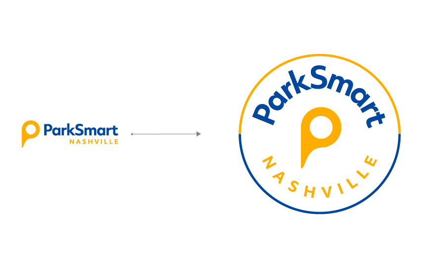

- Submark: A simplified version of the logo, often a smaller icon or a monogram, used in smaller spaces where the full logo might not fit or be necessary.
6. Variations
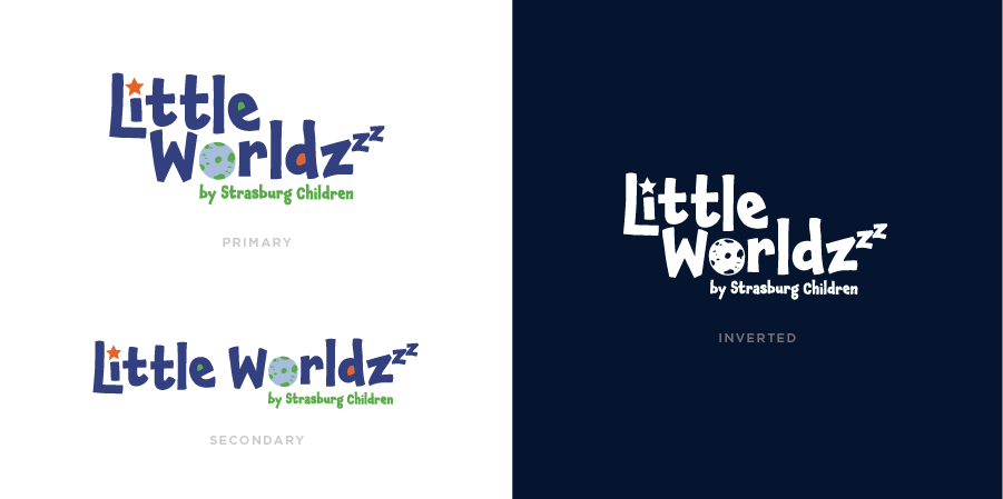

- Primary Logo: The main version of the logo that is used most frequently.
- Secondary Logo: An alternate version of the logo, often a simpler design or a variation that fits different formats (e.g., horizontal or vertical layouts).
- Responsive Logo: A logo that changes in complexity depending on the size and usage, from a full logo with text and icon to just the icon for small screens.
- Monochrome Version: A single-color version of the logo, used in situations where full color isn’t possible or appropriate.
- Inverted Version: A version of the logo that works on dark backgrounds, where the colors are reversed or adjusted.
7. Color Palette
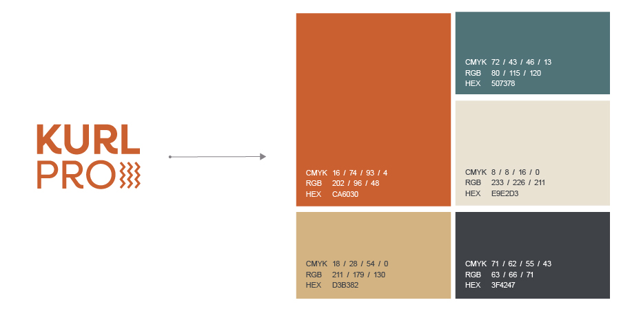

- Brand Colors: The specific colors used in the logo, which are part of the brand’s visual identity. The colors can evoke certain emotions or associations.
8. Font Variations
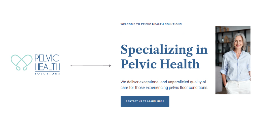

- Custom Typeface: A unique, custom-designed font specifically created for the brand.
- Alternative Fonts: Additional fonts that complement the primary typeface, used for different purposes within the brand’s identity.
9. Grid System
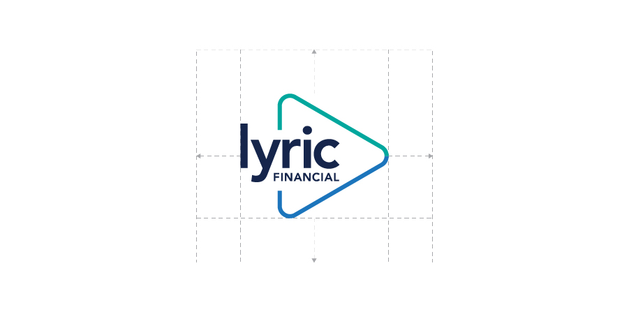

- Grid System: The underlying structure used to design the logo, ensuring that elements are proportionate and aligned.
These elements work together to create a cohesive visual identity for a brand, allowing it to be recognizable across different media and platforms.
Other Logo Design Definitions
Here are some additional logo design terms that we might use:
Lockup
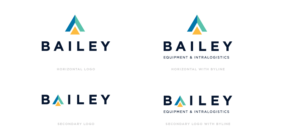

- Definition: A “lockup” refers to a specific arrangement or combination of a brand’s logo elements—such as the logotype (brand name), icon (symbol), and sometimes a tagline or slogan—into a unified design. The lockup ensures that these elements maintain consistent proportions, spacing, and alignment when used together. A typical brand design will likely have more than one logo lockup.
- Example: a horizontal lockup (with or without a tagline), a vertical lockup (with or without a tagline), a “badge” lockup, a “monogram” lockup, an icon-only lockup, or a wordmark lockup.
Negative Space
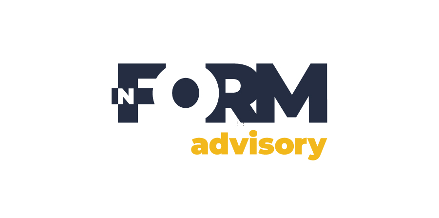

- Definition: The empty or blank space around and between the elements of a logo. Negative space can be used creatively to form hidden images or symbols within the logo, adding depth and interest to the design.
- Example: The FedEx logo uses negative space between the “E” and the “x” to create an arrow.
Kerning
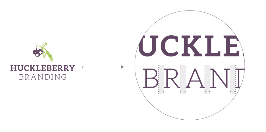
- Definition: The adjustment of the spacing between individual letters in a logotype. Proper kerning ensures that the text in a logo is visually balanced and easy to read.
- Example: Adjusting the space between letters like “A” and “V” to avoid too much or too little space.
Leading
- Definition: The vertical spacing between lines of text in a logotype, particularly when the text is stacked. Leading is important for readability and overall visual appeal.
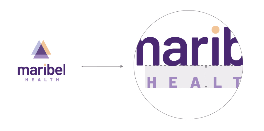
- Example: The distance between the tagline and the brand name in a logo.
Baseline
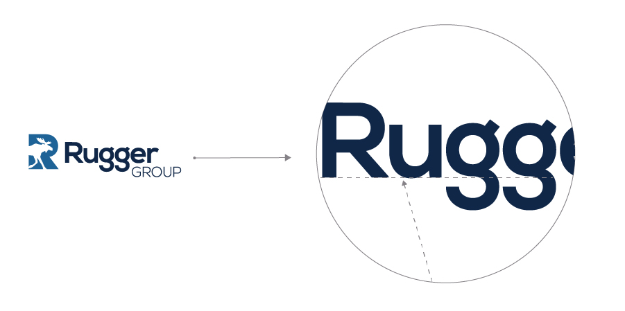
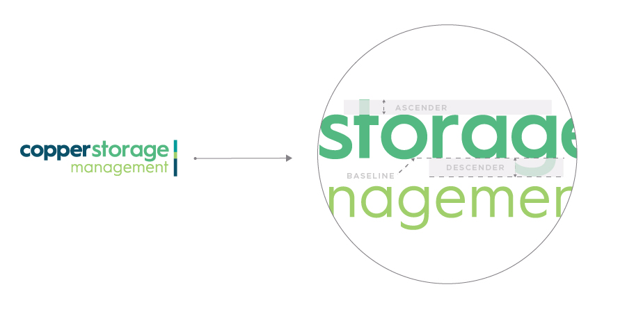
- Definition: The imaginary line upon which most letters in a logo sit. Some letters (like “g” or “p”) extend below this line, while others align perfectly with it.
- Example: Ensuring that the text in the logotype aligns consistently with the baseline to avoid an uneven appearance.
X-Height
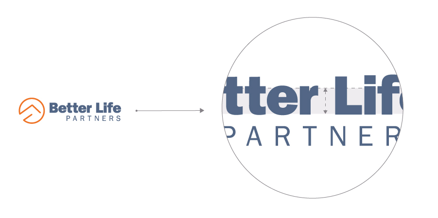
- Definition: The height of the lowercase “x” in a typeface, representing the height of the body of lowercase letters. The x-height influences the overall readability and visual balance of a logotype.
- Example: A larger x-height makes the text appear larger and more legible at smaller sizes.
Ascender and Descender
- Definition: Ascenders are the parts of lowercase letters that extend above the x-height (e.g., “h”, “l”), while descenders are the parts that extend below the baseline (e.g., “g”, “p”).
- Example: In a logotype, careful consideration of ascenders and descenders ensures that the text looks balanced.
Stroke
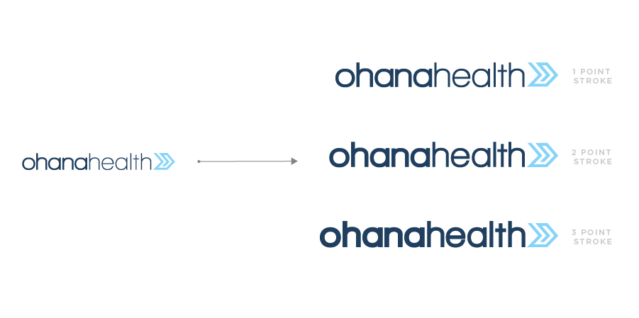
- Definition: The thickness or weight of the lines that make up the letters or elements of a logo. Stroke weight can significantly affect the perception of a logo, making it feel bold, delicate, modern, or classic.
- Example: A thicker stroke gives the logo a more robust and impactful look.
Serif and Sans-Serif
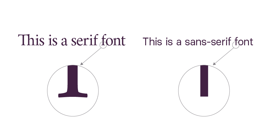
- Definition: Serif refers to the small decorative lines or extensions at the ends of letters, common in traditional fonts. Sans-serif fonts lack these extensions and are more modern and clean.
- Example: Times New Roman is a serif font, while Arial is a sans-serif font.
Gradient
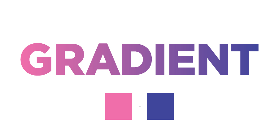
- Definition: A gradual transition between two or more colors or shades. Gradients can add depth and dimension to a logo.
- Example: The Instagram logo uses a gradient from purple to orange.
Monochrome
- Definition: A design that uses only one color, often in varying shades or tints. A monochrome logo can be used in situations where color printing isn’t possible or when a simplified design is needed.
- Example: A black-and-white version of a logo for use on invoices or letterhead.
Glyph
- Definition: An individual character or symbol in a typeface. Glyphs can include letters, numbers, punctuation marks, or special characters, often customized in a logo for unique branding.
- Example: A custom ampersand (&) designed specifically for a brand’s logotype.
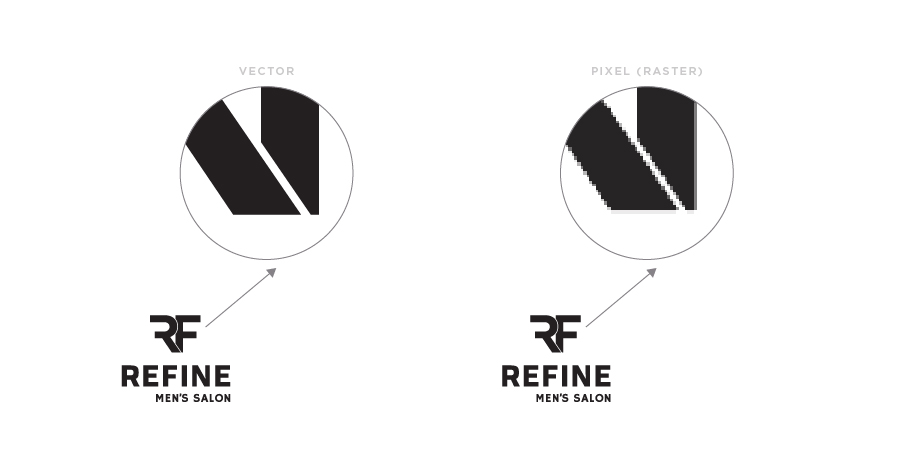
Vector
- Definition: A graphic format that uses mathematical equations to create images, allowing logos to be resized without loss of quality. Vector logos are essential for scalability and consistency across different media.
- Example: Adobe Illustrator is commonly used to create vector logos in formats like .AI, .EPS, or .SVG.
Pixel (Raster)
- Definition: The smallest unit of a digital image, typically used in raster graphics, which are resolution-dependent. Unlike vector graphics, raster images can lose quality when scaled up.
- Example: Logos saved as .PNG or .JPEG are raster images.
Opacity

- Definition: The degree of transparency in a logo element. Adjusting opacity can create layering effects, highlight specific parts of the logo, or make it more adaptable to different backgrounds.
- Example: A logo with a semi-transparent background might blend more seamlessly with website images.
Pantone
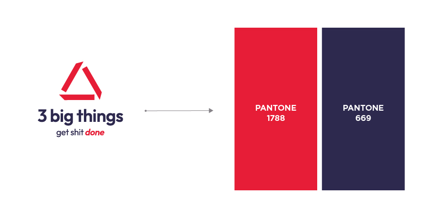
- Definition: A standardized color matching system used in printing. Pantone colors ensure that specific hues remain consistent across different materials and printers.
- Example: Using Pantone 186 C to guarantee a brand’s red color looks the same on all printed materials.


